
HubSpot blog offers a comprehensive guide on how to get the most out of your homepage by featuring key elements a successful homepage should have. In this article, we are going to look into those crucial parts and see how they can be handled using the Adamant theme.
Critical elements every homepage should have
HubSpot blog suggests that the homepage better consist of these 12 crucial parts:
- Headline
- Subheadline
- Primary call-to-action
- Secondary call-to-action
- Supporting image
- Benefits
- Features
- Social proof
- Success indicators
- Navigation
- Content offer
- Resources
Below, we will focus on 11 of 12, excluding navigation for now. It's a global element on every page, not just the homepage. Moreover, it's so special that navigation might need a separate article.
Headline
The key message you want to convey to your visitors better be incorporated in the main headline, which usually is part of the hero section. By default, Adamant's homepage has a slider as a hero section hosting the headline. This solution is perfect for multiple messages for different user profiles. In case you're looking for alternatives, here's what they might look like inside Adamant theme.

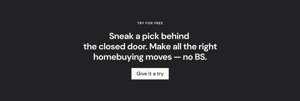

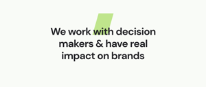
All of the examples above are Adamant sections — prebuilt assembly of custom and default modules. They can be added to the page by clicking on the plus icon between sections on the page canvas, like this:

Subheadline
Extra text to provide more info on the key message is called a subheadline, the size and the design of which depends on the headline. Sometimes subheadline is a paragraph. Sometimes, it's one concise sentence. The case with no headline is also acceptable if your headline is descriptive enough to convey your main message.
In the Adamant theme, the subheadline can be handled as part of one text element shared with the headline and as a separate text element. Both are possible in the section examples above.
Primary calls-to-action
Adamant has two custom modules for buttons to compel visitors to explore more than the homepage. Those are Button and Button Stack.
These modules are pretty similar. Both can be added to any prebuilt section or newly created as well. Just drop it from the modules list onto the page's canvas. They have the same set of settings. The only difference (the hint is in the name) is that one is a single button element, while the other allows the creation of a set of buttons placed next to each other. The button stack approach provides better control over the spacing between the buttons and the alignment on the page.
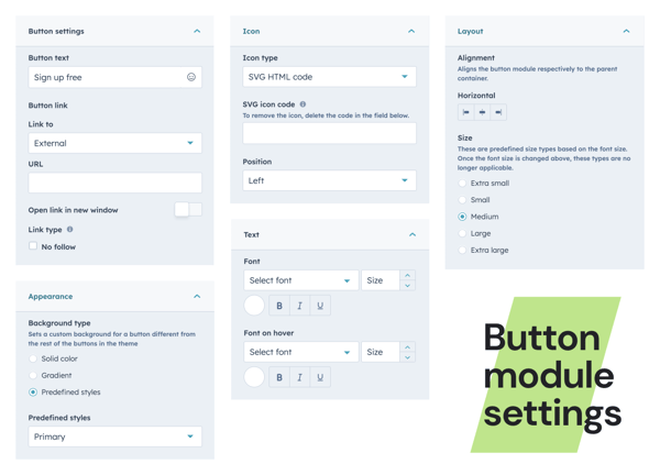
Theme buttons work as regular buttons without any analytics being attached to them. In case you'd like a more in-depth overview of how your calls-to-action perform, it's better to use a native HubSpot module called Call-to-Action. HubSpot offers guidance on how to customize their CTAs in their own documentation.
Secondary call-to-action
One more recommendation from the HubSpot team is to sprinkle secondary CTA's below the fold to give visitors something to click on while exploring your homepage.
Inside Adamant, there are five predefined styles for buttons. Obviously, the primary one is the most important and should be reserved for the main action, which we covered earlier in the article. When it comes to secondary actions, they can be induced with buttons stylized in four different ways, which are inside theme settings called:
- Secondary:
Uses the secondary accent color as a background - Tertiary:
Outlined button - Inverted:
Uses the main light color good for dark or colored surfaces - Ink:
Solely text label with some decoration

You are free to change these styles globally in the main theme settings or individually for a particular button module entity added to the page.
Supporting image
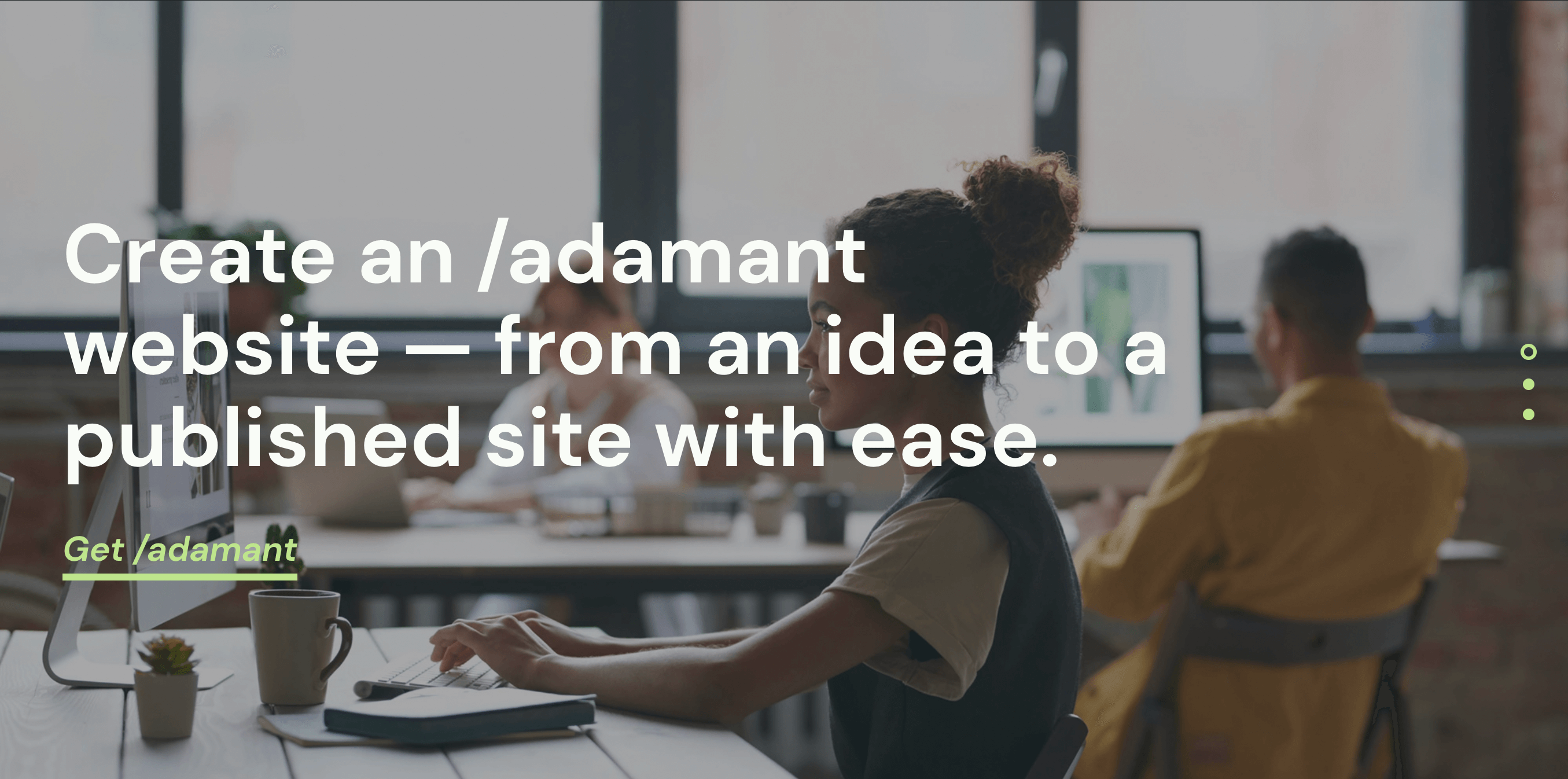
Seeing something for once can be more powerful than hundreds of words, as they say. That's why having a supporting image is crucial for an emotional connection with visitors. In the Adamant theme, such imagery can be added through Hero Banner and Hero Slider. Adding default HubSpot modules like Image, Image Slider, Image Grid, and Image Gallery.

Benefits
One of the most important things to tell on the homepage is the reasons why what you're offering is great. Adamant offers plenty of components to work with in order to display the benefits of your business.
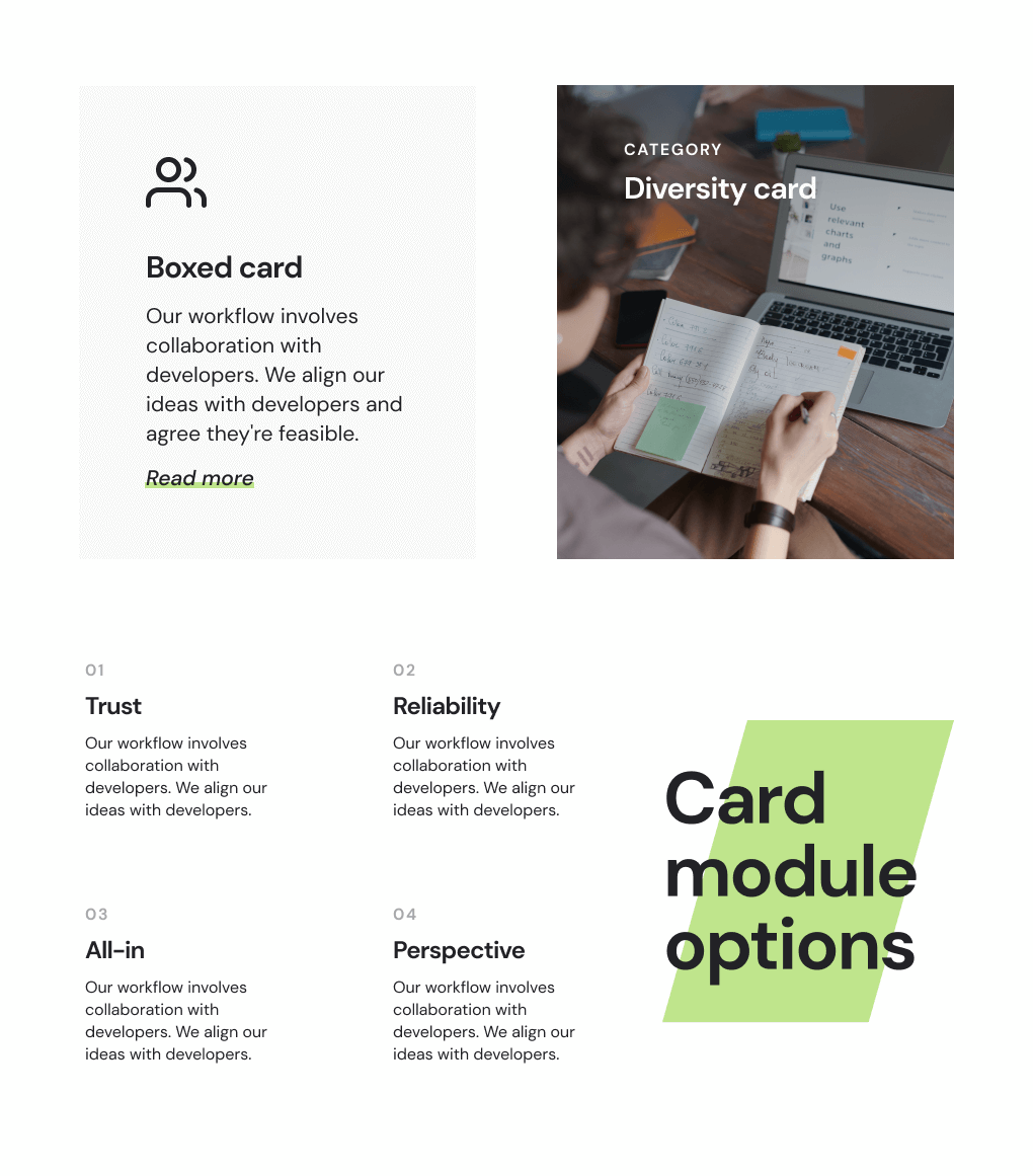
Depending on your design and type of content for benefits, you may choose among three types of card modules — Boxed, Grid, and Visual.
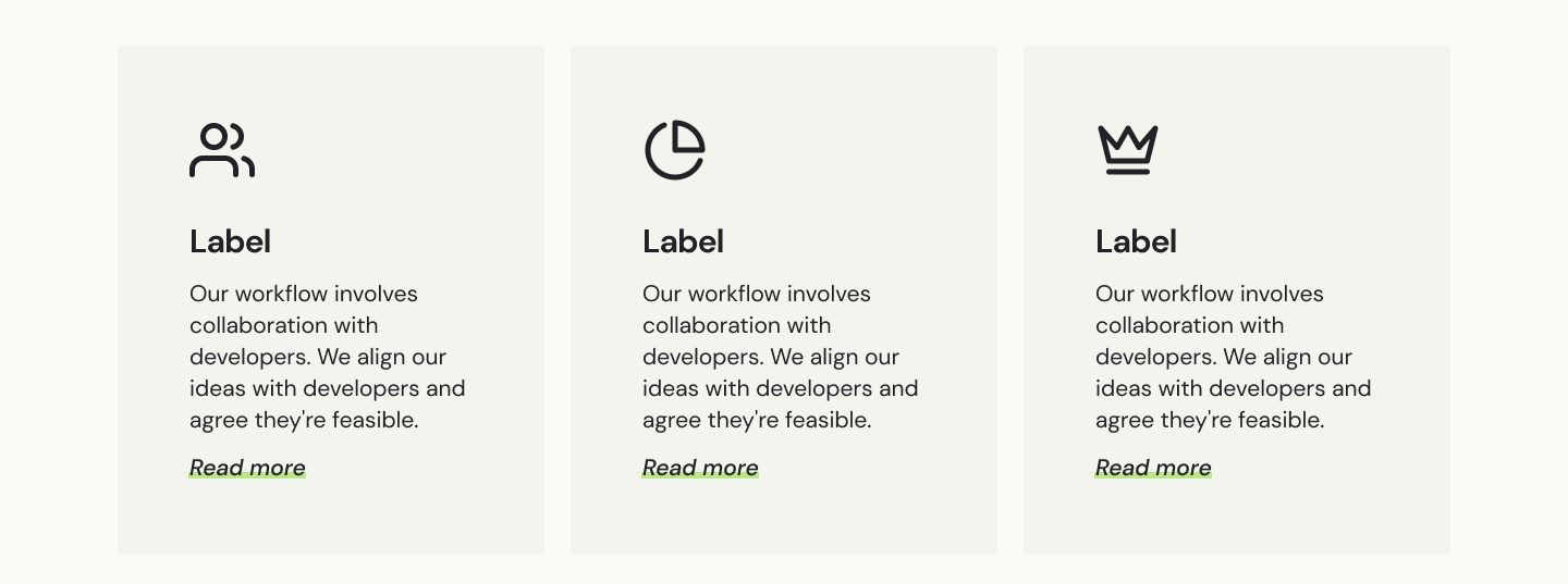
Along with modules, prebuilt sections can also be used for benefits. We recommend Cards and Services sections for these purposes.

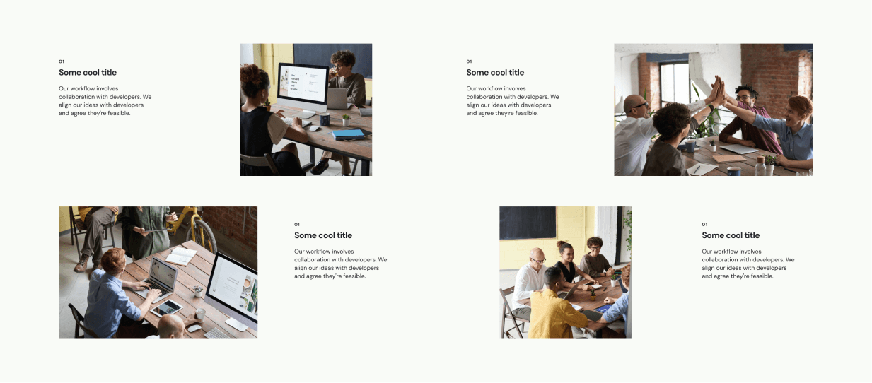
There is also a variety of side-by-side sections that might also work well for benefits, once again, depending on your design choices. These side-by-side's are called Info with Image… where the difference is the side where the image is placed and the aspect ratio of that image.
Features
In addition to the benefits list, having a list of features is another best practice. Since both are lists by their nature, we recommend using similar modules and sections that we mentioned above covering benefits — Cards, Services, etc.
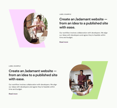
In addition to that, there are sections called Feature (varies by image positioning — left or right). Their purpose is for a more detailed description of one feature to spur on the page among other content.
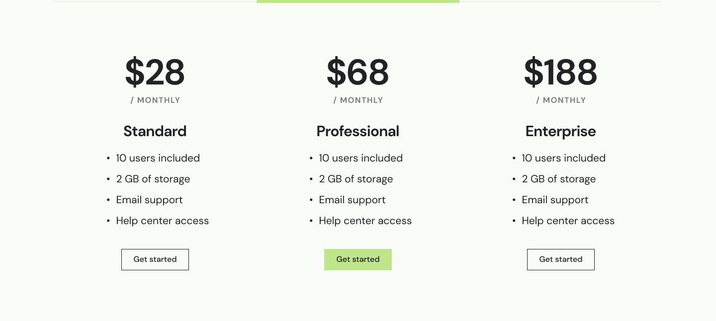
Another option to introduce features is to use pricing cards right away on your homepage as Dropbox for Business did. For that, Adamant has a Pricing section, which is built of Pricing Card modules.
Social proof
One of the keys to gaining people's trust is to show them others' opinions on the product or services. Here's when the social proof comes in. In Adamant, we have two powerful modules to host your clients' feedback — Testimonial Feed and Testimonial Slider.
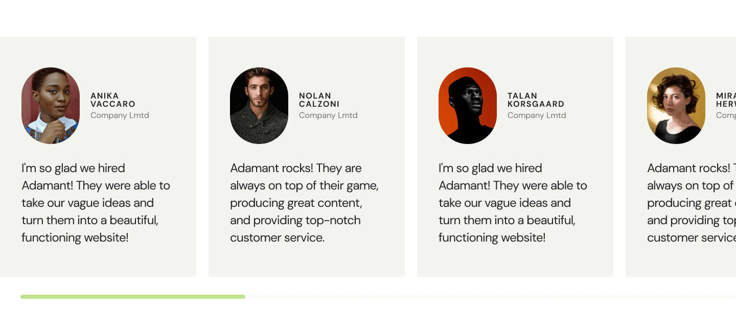
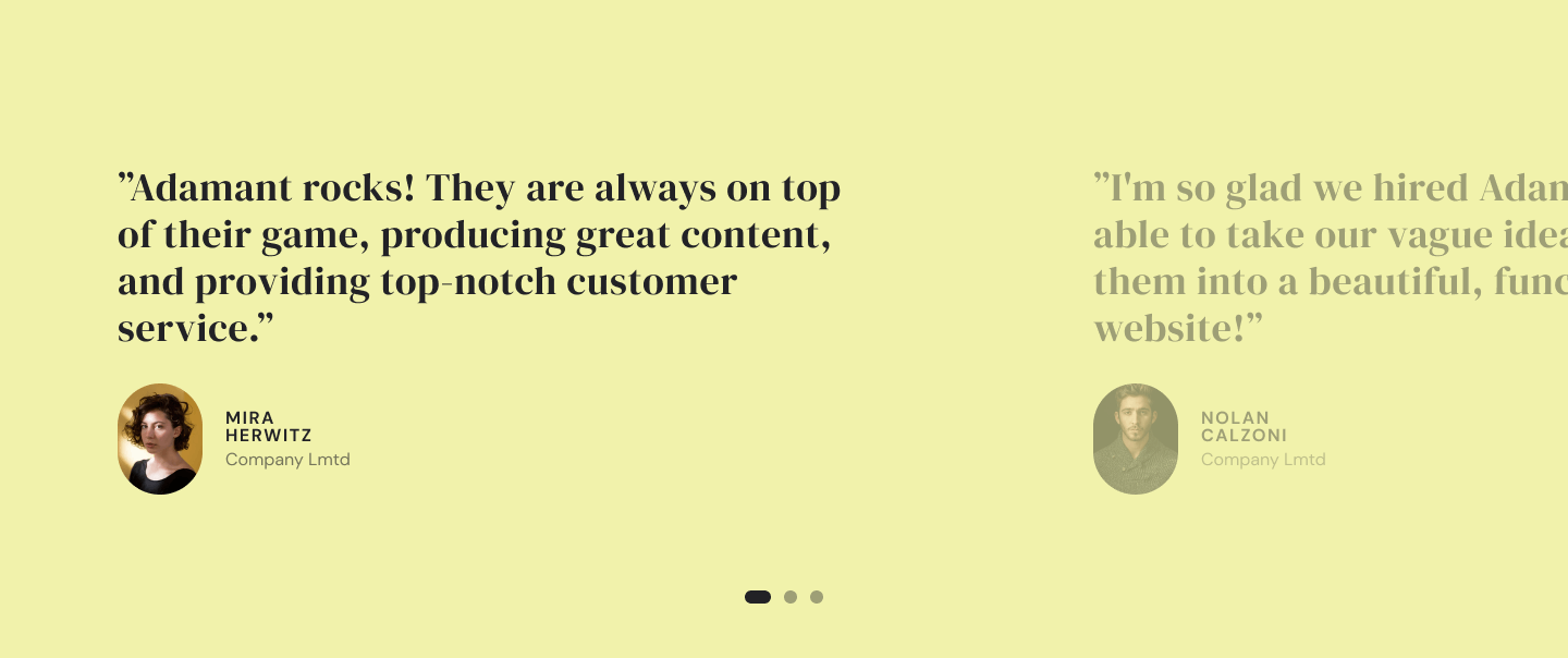
You might want to have testimonials in there or numerous. Both modules are flexible about turning from dynamic to static and vice versa. The only limitation to consider is the max number of items in the Testimonial Slider. Due to its design, the limit is ten slides for this module.
Success indicators
Another way to set up trust is to show some previous success, like awards, achievements, and recognitions. Usually, that comes with some numbers. Adamant has a special module for that type of information. It's animated numbers on load, plus some description.

Content offer
Since it's a theme for the HubSpot platform, no way we would avoid inbound. Offering some goodies like ebooks and guides is essential to inbound marketing. We recommend using the Visual Cards section that hosts three card modules where you can offer your resources or other inbound strategies.

Besides this section, we encourage you to explore other sections or combine custom with default modules. All of that is possible and pretty flexible inside the Adamant theme.
Resources
For those who are looking for in-depth information on your offering, it's good to have a resources directory. Usually, it's placed somewhere closer to the bottom of the page or in the footer. Adamant has a module called Footer Menu that can store plenty of links to all other pages in your site tree.
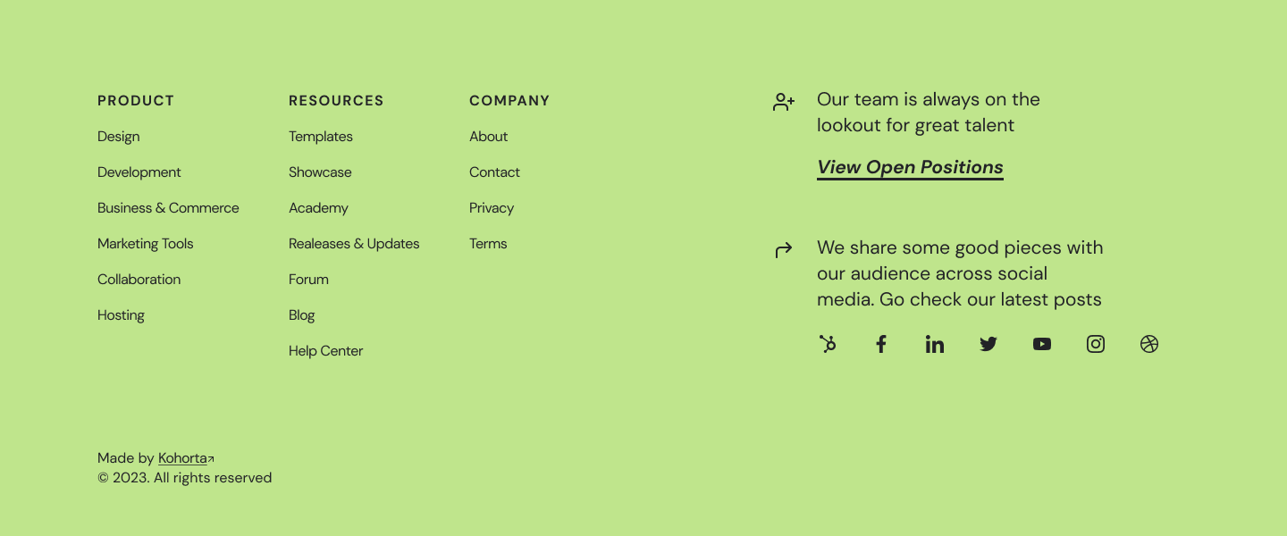
When it comes to dealing with lots of links on the page, we recommend using the Menu module, which allows you to choose any menu from the navigation settings in HubSpot. There is an in-depth guide on how to create and edit menus in the HubSpot knowledgebase.
Make your home worth visiting
The Adamant theme for HubSpot provides a flexible and powerful solution for creating a homepage that incorporates all the critical elements recommended by the HubSpot blog. From headlines and calls-to-action to social proof and resources, Adamant offers a wide range of customizable modules and prebuilt sections that cater to the needs of any business. By following the tips provided in this article and leveraging the full potential of the Adamant theme, you can create an engaging, user-friendly, and effective homepage that drives conversions and showcases your brand's unique selling points. So, go ahead and explore the various options within the Adamant theme to create a homepage that truly stands out and helps your business achieve its goals. Download Adamant theme on the HubSpot marketplace.
